
Project Healthy Eats
Providing nourishment to the community.
Duration
2-week design sprint
Team
Charles Cho, Nicole Cruz
My Role
UX Designer (Research, UI design)
DO YOU KNOW what the best medicine is for fighting illnesses?
Food.
As World Health Organization puts it, ”A healthy diet helps to protect against malnutrition in all its forms, such as diabetes, heart disease, stroke and cancer.”
Providing nutritious food to sick and elderly neighbors in Oakland and San Francisco has been the mission for Project Healthy Eats since 1985. However, recent data shows a decrease in applicants and volunteers.
Why is that?
Problem Diagnosis: Evaluating Existing Site
To investigate the problems a bit further, I initiated a heuristic evaluation to understand what is causing the issue.
Findings:
Important information wasn’t visible
Hard to view volunteer sign-up page
Application page was lengthy


How might we better the ease of use and visibility of data on Project Healthy Eats’ mobile site?
What motivates people to volunteer?
Insights from the 30+ surveys:

Key Takeaways
Volunteering is social
People heard about opportunities through friends / family
User also validated the above points during the interview:
“I was already kind of pretty predisposed to wanting to do something different for Thanksgiving and when my friend recommended that we volunteer, I was like, ‘Yeah that sounds really cool!’“
“We’ve volunteered together before and I’ve always had a good time going with her and tagging along.“
Understand Our Users


So… why mobile?
From our research, we learned that:
67% of Americans share about events happening in their community, such as volunteering, using their mobile devices. (—2015 Pew Research)
For users like Robin, it is much more likely that a smartphone, is their primary connected device and that they are more likely to use their smartphone for tasks traditionally reserved for larger screens, such as submitting applications. (—2016 & 2019 Pew Research)
User Flows

Design Ideation and Iteration
Based on the results from comparative analysis and feature prioritization, we jumped into building mid-fidelity wireframe.

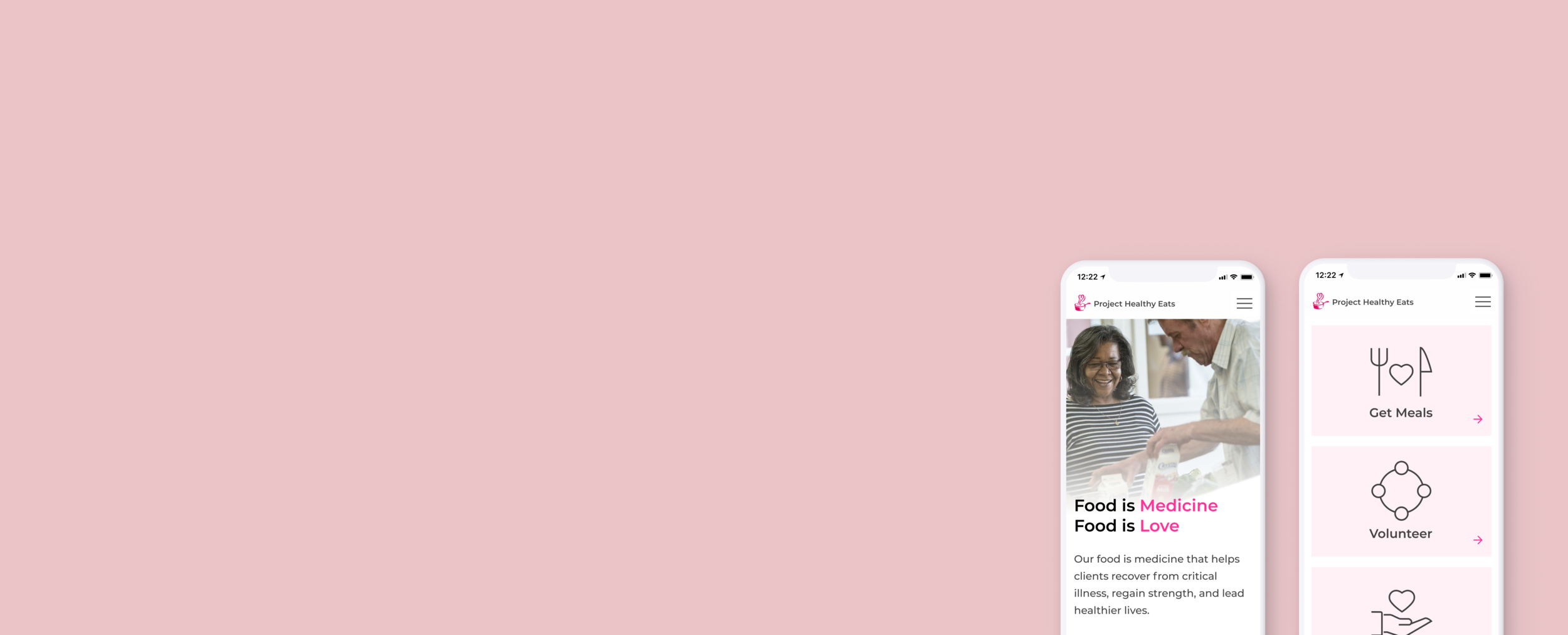
Solution
Simple Design
Helps users understand Project Healthy Eats’ cause through introducing their mission and history
Establishes trust and professionalism by displaying partner logos
Clear CTA for volunteers and recipients

Informative Scheduling Process
Never miss key information such as volunteer requirements and minimum time commitment
Digest information easily
Different colors to indicate available slots
Invite others to volunteer by sharing on social media

Streamlined Application Process
Enlarged text option for low vision users
Email doctors without leaving the site
Sign-off with ease with PDF application form pre-attached
Receive confirmation email, no personal record retained on the site

Style Guide
Leveraging my visual design skills and eye for photography, I chose colors that would work with hot pink (brand color), and make it easy for users to take in information.

Next Steps
Restructuring information on desktop site
Work on the desktop site so users can utilize both desktop and mobile sites
Maintaining users’ confidentiality
Continue to research ways to protect our users’ confidentiality when using the email function
Check color contrast for accessibility
Colors used pass the WCAG guidelines for accessibility as well as the colorblind stimulation
Reflections
Common end goal is key for collaboration
I worked with 2 other designers on my team who have very different work styles. I learned that no matter who you work with, having a common goal is very important.
Importance of secondary research
From this project, I learned that secondary research is just as important as primary research. It helped clarify a lot of our research questions and assumptions. I wish that we have done more secondary research prior to writing survey questions though. That way, we would’ve had a better understanding of the overall problem.