
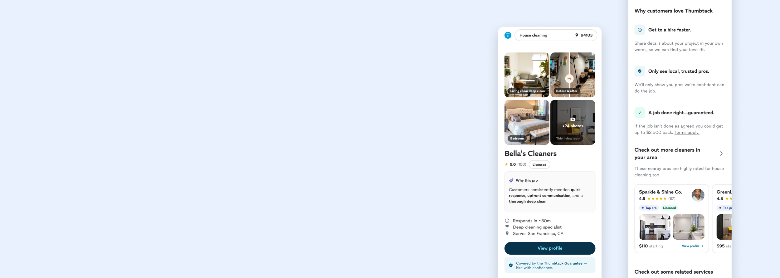
Redefining paid social acquisition
Finding the right direction for Thumbtack's largest acquisition channel.
Overview
Thumbtack is a home services marketplace connecting homeowners with local professionals.
Paid Social was one of Thumbtack’s highest-traffic channels, but one of its lowest converting.
Users clicked curated ads and landed directly on a Service Provider (SP) page designed for users already ready to hire.
My role: Turned an understudied growth opportunity into a testable product strategy
-
Role
Product Strategy & Vision
Interaction Design
Behavioral Design -
Team
Growth PM, Paid Social Marketing, Web Optimization, User Researcher
-
Timeline
May-Jun 2026
Understanding an understudied cohort
We knew Paid Social was underperforming. We didn’t know why.
Paid Social generated 13% of our total traffic, becoming our second largest acquisition channel. However, the conversion rate was only at 0.3%, comparing to 3% sitewide average.
Because we were actively spending money on Facebook and Instagram ads to bring these users in, every dropped user represented both wasted marketing spend and lost revenue.

Paid Social generated 13% of our total traffic, becoming our second largest acquisition channel. However, the conversion rate was only at 0.3%, comparing to 3% sitewide average.
Company is also sending money on funding paid ads, so if we can increase traffic conversion, we could save roughly ~$x on spends.
Unlike users who moved through Thumbtack’s native discovery flow, Paid Social users landed directly on a Service Provider page (SP page) - without marketplace context and pro comparison.
Most existing research done on SP page also reflected users who were already closer to hiring, leaving major knowledge gap around Paid Social users.
My challenge was to turn those unknowns into hypotheses the team could actually test.
Turing fragmented signals into a behavioral model
Rather than jumping directly into another redesign, I triangulated evidence from the existing journey, historical research and experiments, behavioral data, and the Paid Social team's domain knowledge.
Each investigation helped answer a different question:
1.Journey diagnostic: Where might the journey be breaking?
Typical Thumbtack journey
Search → Define project → Compare pros → Evaluate pro → Request
By the time these users reached a Service Provider page, they had already established project intent and comparison context.
Paid Social journey
Social ad → Evaluate pro → Request
Paid Social users bypassed those context-building steps and arrived directly at evaluation. The same SP experience was therefore serving users with very different levels of intent and context.
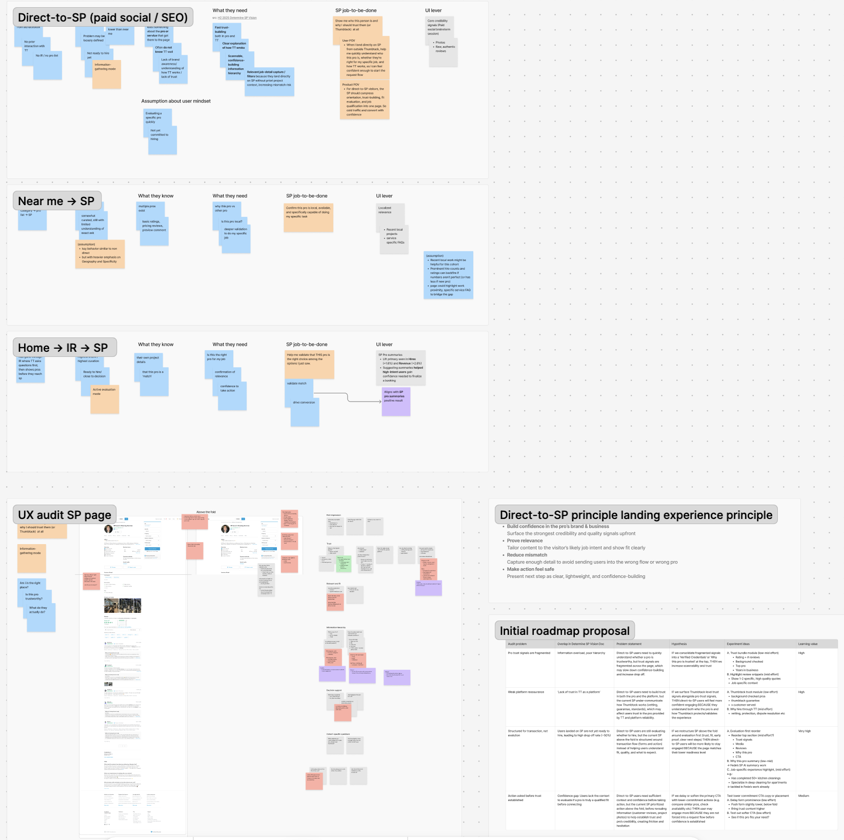
2.Cross-functional hypothesis workshop
Which assumptions were actually worth testing?
Because much of our understanding was still inferred, I partnered with Product and Paid Social to bring together what we knew from the product with what Marketing understood about acquisition behavior.
Rather than treating those assumptions as user truths, I organized them into four behavioral hypotheses:
Match expectation
Preserve the context that earned the ad clickBuild confidence
Surface credible pro evidence earlierCreate clarity
Explain why you’re here and what happens nextEarn commitment
Make the next action appropriate to the user’s level of intent
This gave the team a shared framework for discussing Paid Social friction, and turned a collection of ideas into explicit hypotheses we could design and test against.
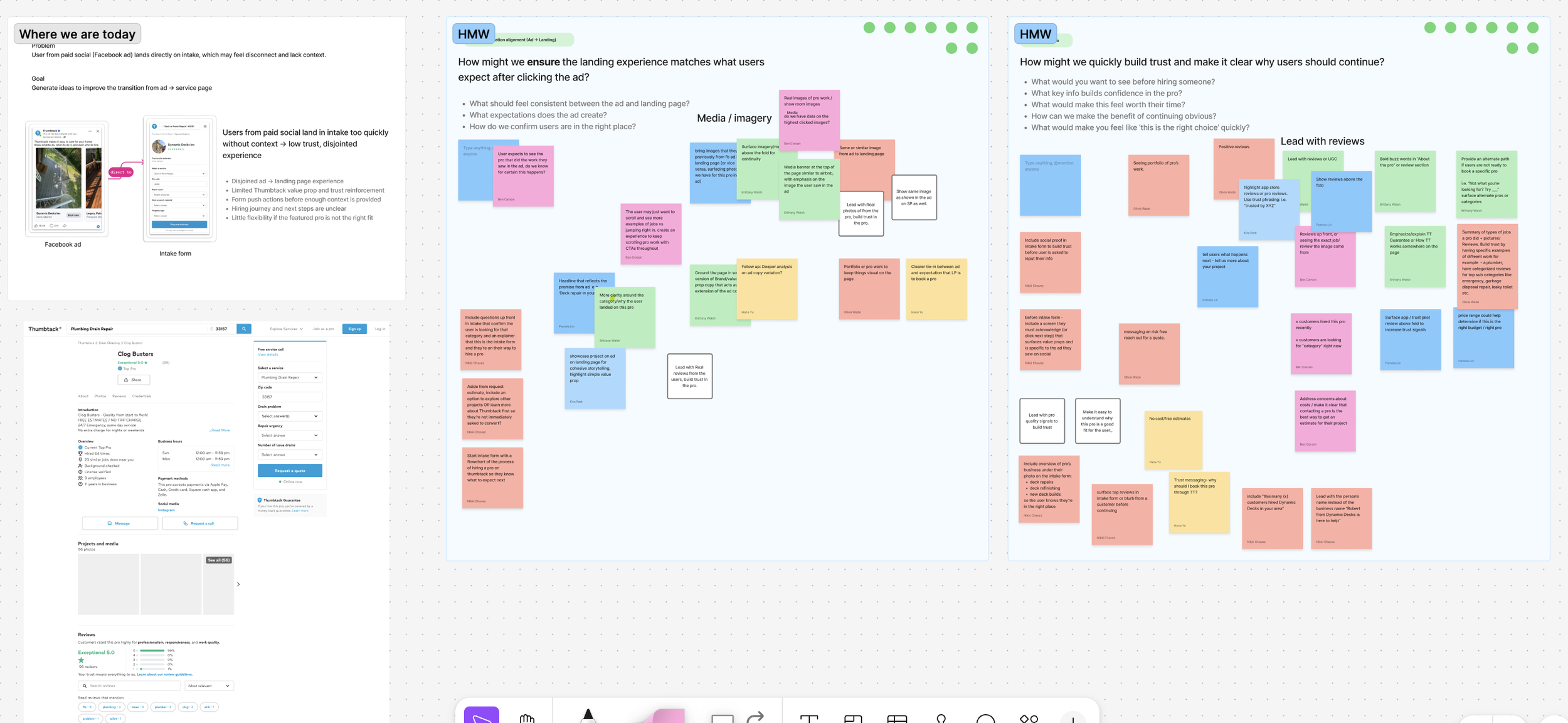
From behavioral hypotheses to a testing strategy
Once we had a clearer model of the problem, I used it to structure our experimentation at two different altitudes.
Track 1: Optimize the existing journey
Hypothesis: Confidence
Could stronger social proof help users build trust without changing the underlying journey?
I designed a low-lift experiment that elevated raw reviews earlier on SP, balancing trust-building against the risk of disrupting conversion momentum.
Track 2 — Challenge the journey itself
Hypotheses: Expectation + Clarity + Commitment
On the other hand, we wanted to take a bigger bet and see if having an interstitial page sits between ad → SP would orient Paid Social users and increase their confidence in hiring.
I asked myself: How might we bridge the gap between ad curiosity and provider evaluation?
Concept 1: Integrated narrative
Confidence comes from knowing context, clarity, and direction.
Concept 2: Proof through breadth
Confidence comes from seeing evidence of successful work.
Concept 3: Pro info
Confidence comes from understanding the professional.
Working closely with User Research, I translated each hypothesis into a high-fidelity prototype for moderated concept testing.
We wanted to understand: Which approach makes first-time visitors feel ready to continue? And if a net new surface strengthen their confidence.
Testing the concepts side by side let us evaluate the underlying confidence-building strategy.
From assumptions to evidence
The study tested three concepts against the existing experience. The baseline ultimately performed best overall, while the research surfaced several key insights of cohort behavior:
Validated high media impact
Proved single-pro focus > multi-pro directory
Strategic impact
The project shifted the team from debating ideas to making evidence-based product decisions.
Built a shared understanding of Paid Social users across Product, Growth, and Engineering.
Avoided investing in a larger redesign before validating the opportunity
Transformed a broad vision effort into three researchable hypotheses around how users build confidence
Established an evidence-based direction the team could continue building